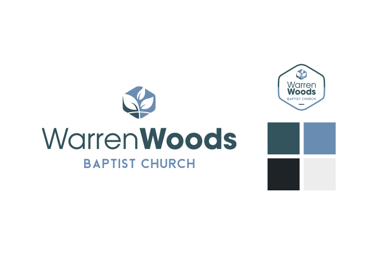
Warren Woods Logo & Branding
Warren Woods updated their logo to a modern design with using sans serif fonts in various weights. The icon design is modern using a hexagon shape with leaves as the focal point, signifying growth and life. The curved line below across the leaves subtly symbolizes the Christian Cross. Muted blues have been used for longevity [...]
Glenmont Dental Logo
This dentist office asked for a family friendly logo for their practice that's been open for nearly 40 years. They also wanted the logo to look exclusive and have a modern flare. The thinner sans serif font exemplifies the exclusivity of the practice, the tooth give it its modernity, and the curve of "Dentistry" keeps [...]
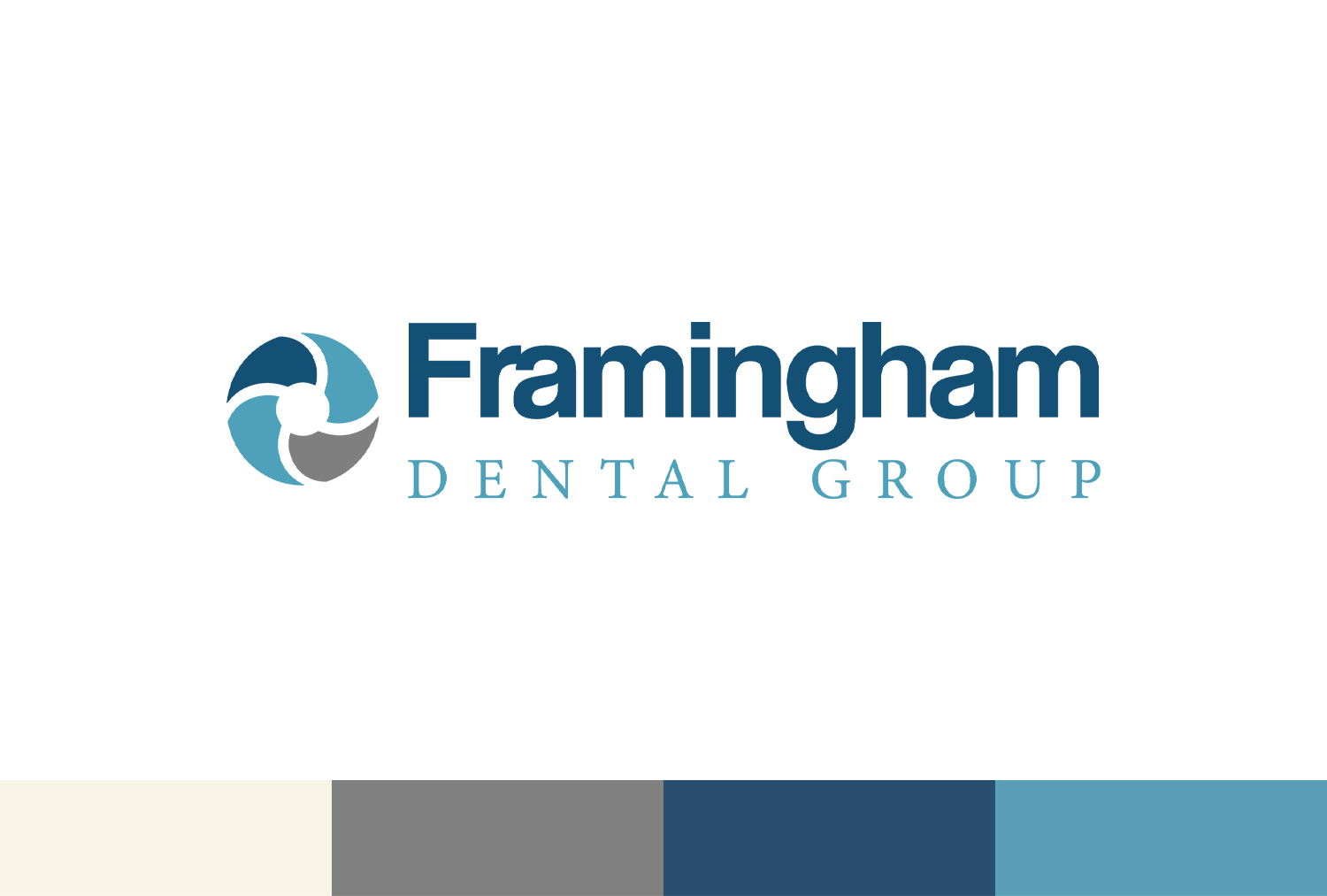
Framingham Dental Group Logo & Branding
A logo and brand guidelines, created for Framingham Dental Group, communicated through color, font choice and the circular design icon, which represents the family value of this dental group. Both one color and two color options were designed for this logo for versatility. Primary and secondary colors were provided, along with font guidelines.
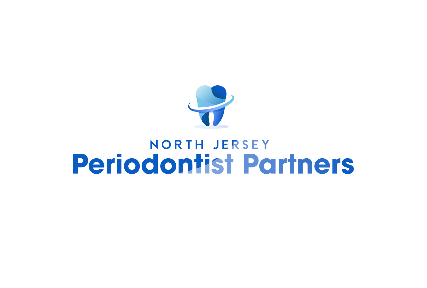
North Jersey Periodontist Partners Logo & Branding
A logo and brand guidelines, created for North Jersey Periodontist Partners, communicated with layers and curves of color, gradients and 3D effects. Simple modern fonts were chosen to go along with the fresh, clean, dental color scheme and logo.
NJ Clear Aligners Branding
A logo and brand guidelines, created for NJ Clear Aligners, communicated with simplicity through color and design. Both one color and two color options were designed for this logo for versatility. Primary and secondary colors were provided, along with font guidelines.
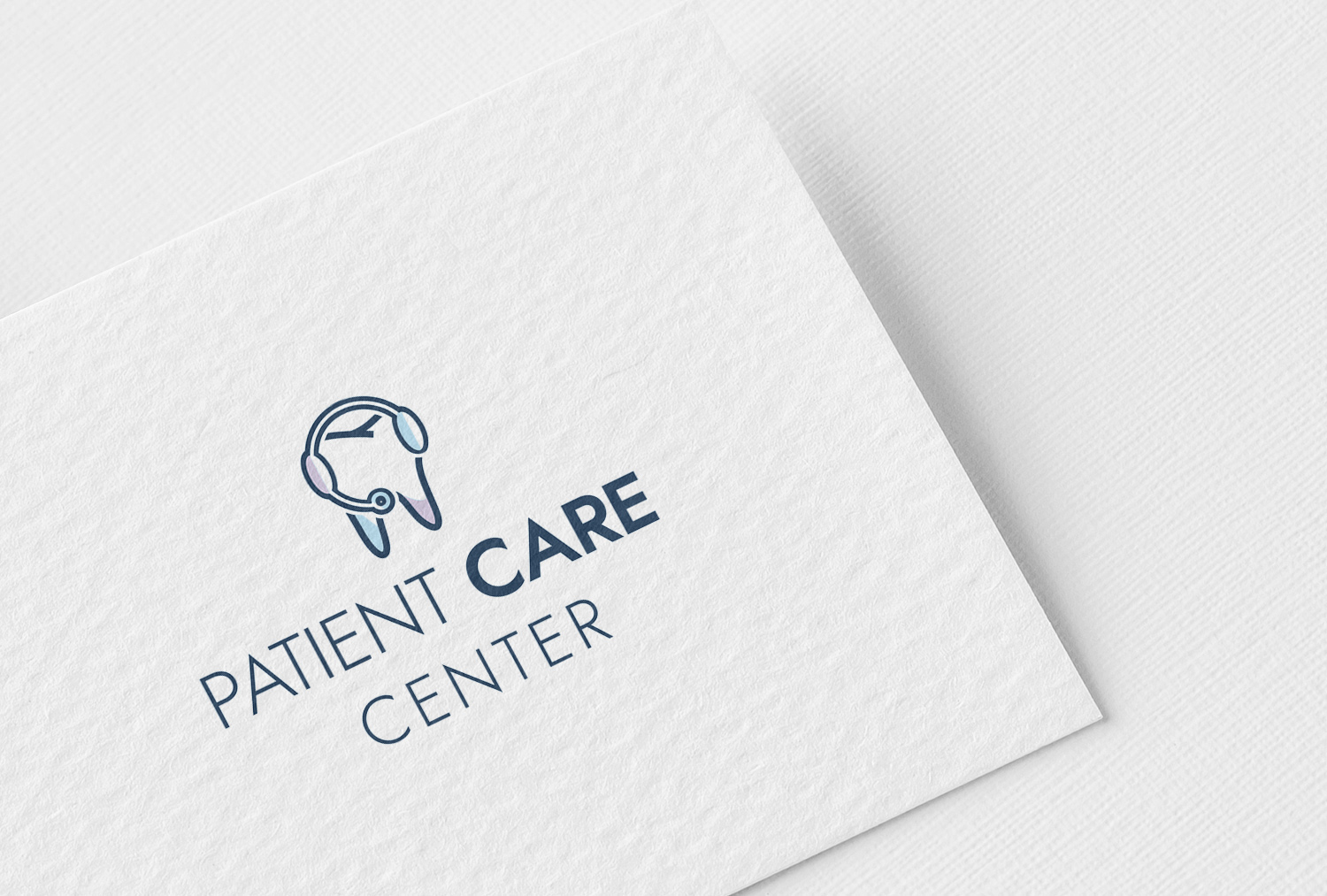
Patient Care Center Branding
The Patient Care Center, a department within a DSO (Dental Service Organization), calls patients about their dental appointments, needs and concerns. This department has their own branding to give them independence and inspiration apart from the company they are within. Large canvas posters and smaller foam core boards for their desks were designed with their [...]
Jimmy Howard Foundation Logo
Detroit Red Wings Goalie, Jimmy Howard, needed a logo and branding for his foundation. The font and color scheme work together to remind us of Howard's hockey team. The straight lines and bold simple font offer modernity. Check out his website, created and designed by yours truly, here.
Royal Life Photography Logo
Royal Life Photography shoots a wide range of photos including family portraits, model portfolios, senior pictures, weddings, and automotive photography. This client requested that his logo resembles a stamp and includes some detail. The texture of this graphic and circular form gives it a stamp-like resemblance; the jewels in the crown gives the logo some [...]