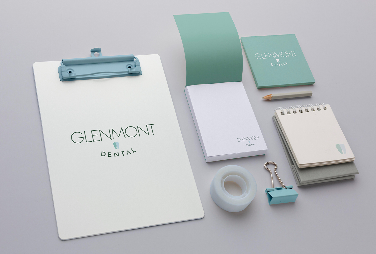
Project Description
This dentist office asked for a family friendly logo for their practice that’s been open for nearly 40 years. They also wanted the logo to look exclusive and have a modern flare. The thinner sans serif font exemplifies the exclusivity of the practice, the tooth give it its modernity, and the curve of “Dentistry” keeps that family friendly vibe.